NeNam
A UI Case Study
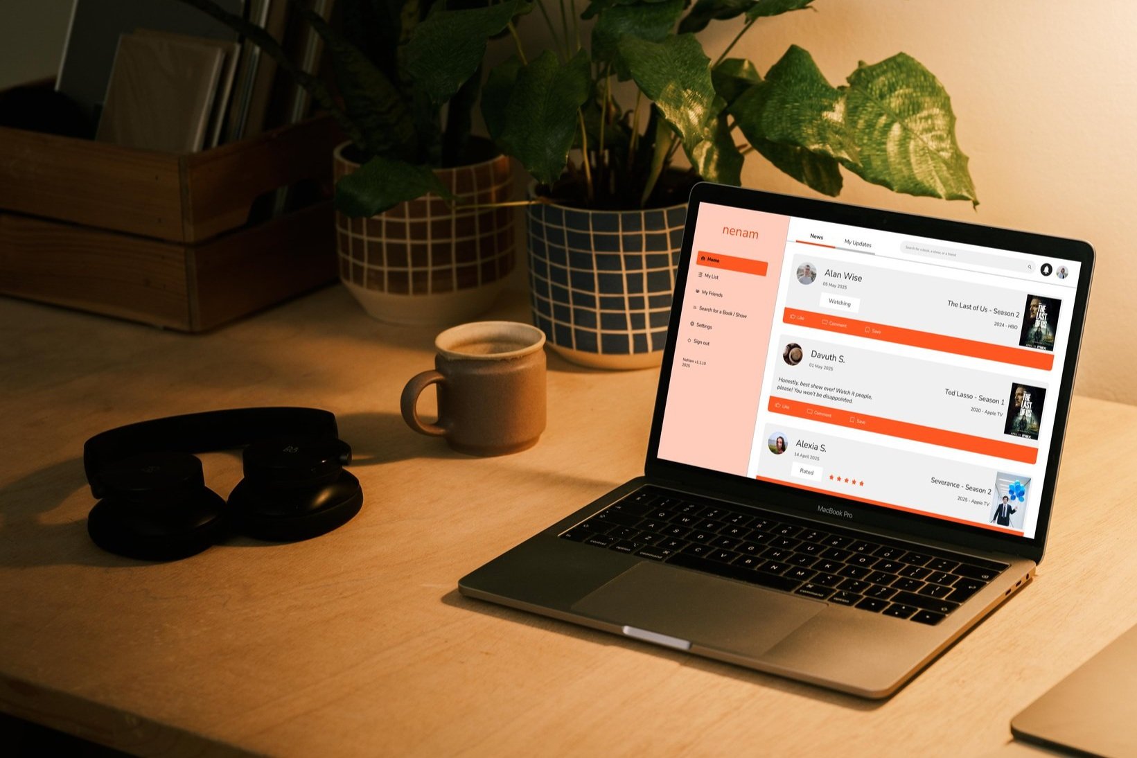
NeNam is a social platform for discovering, sharing, and discussing books and shows with friends.
It's a responsive web app, accessible across mobile, tablet, and desktop.

“Deciding what book to read next could some time be a real chore” - Isabelle
Unaddressed Need
Most tracking apps are built for solo use and shaped by algorithms or ads - not your friends. There’s no easy way to see what they’re reading or watching, or to talk about it. NeNam fills this gap by making discovery personal, social, and driven by real connections.
Objective
Born from a real challenge my friends and I faced, NeNam is a social platform for discovering, sharing, and discussing books and shows through ratings, reviews, and real-time activity.
Project Details
My Role
UI Designer
Duration
April-June 2025
Tools
Figma
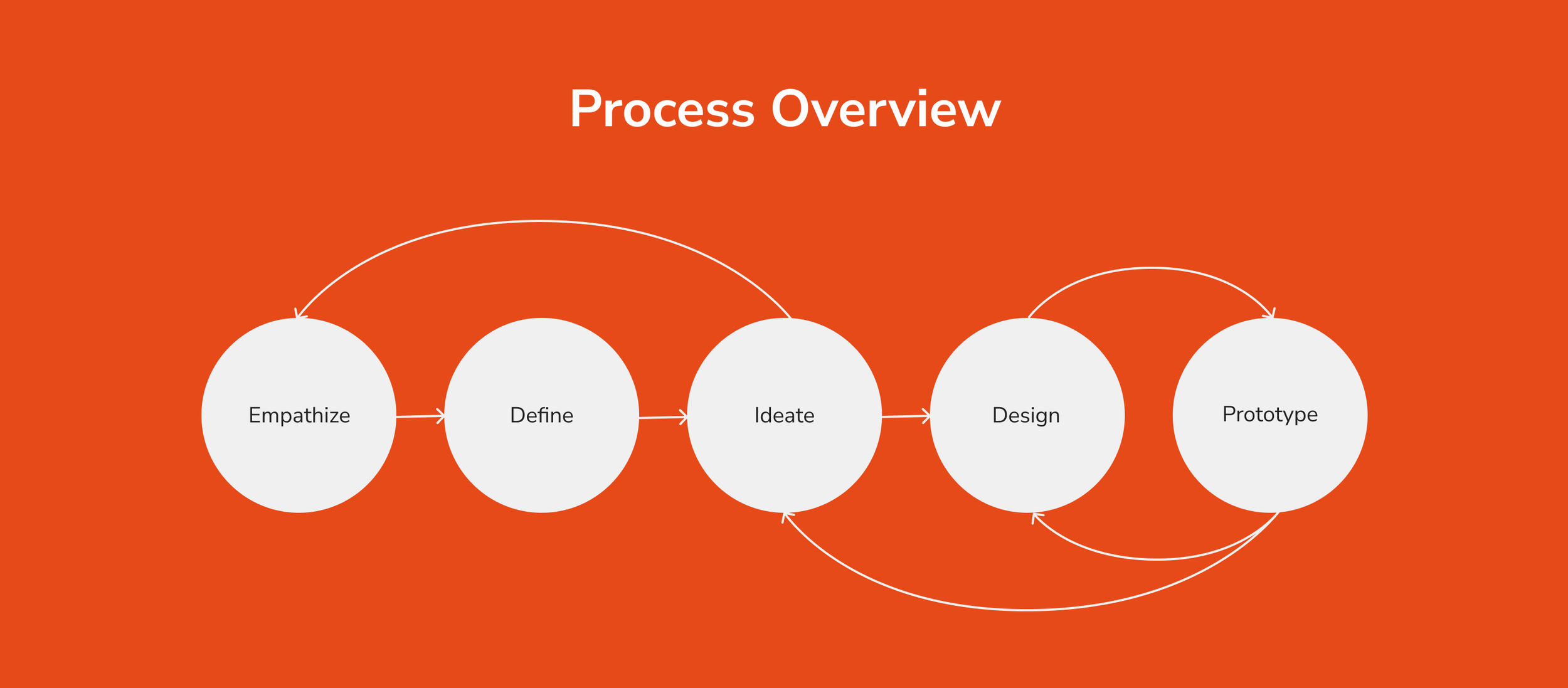
01
Emphathize
First, a project brief is developed to define a clear and focused direction. It serves as a reference throughout the project to ensure the team stays aligned and on track.
Project Brief
We will highlight two elements in the project brief here:
the 5Ws
the persona
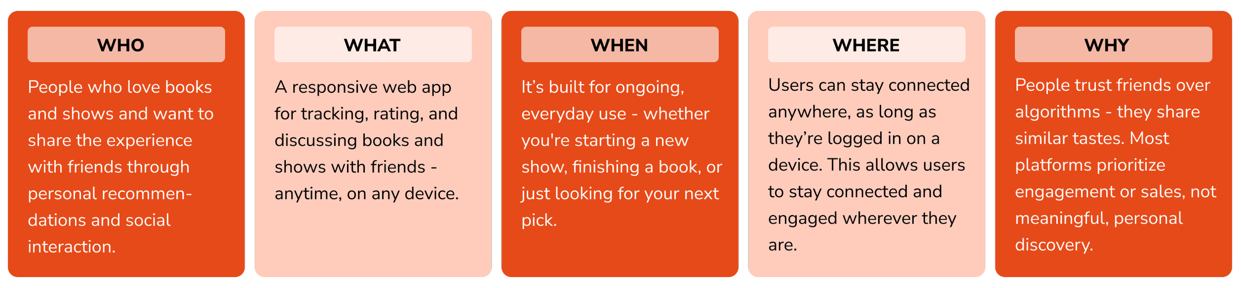
Answering the 5Ws helped shape a solution with clear intent, user empathy, and strategic focus - resulting in a more effective, user-centered outcome.
5Ws
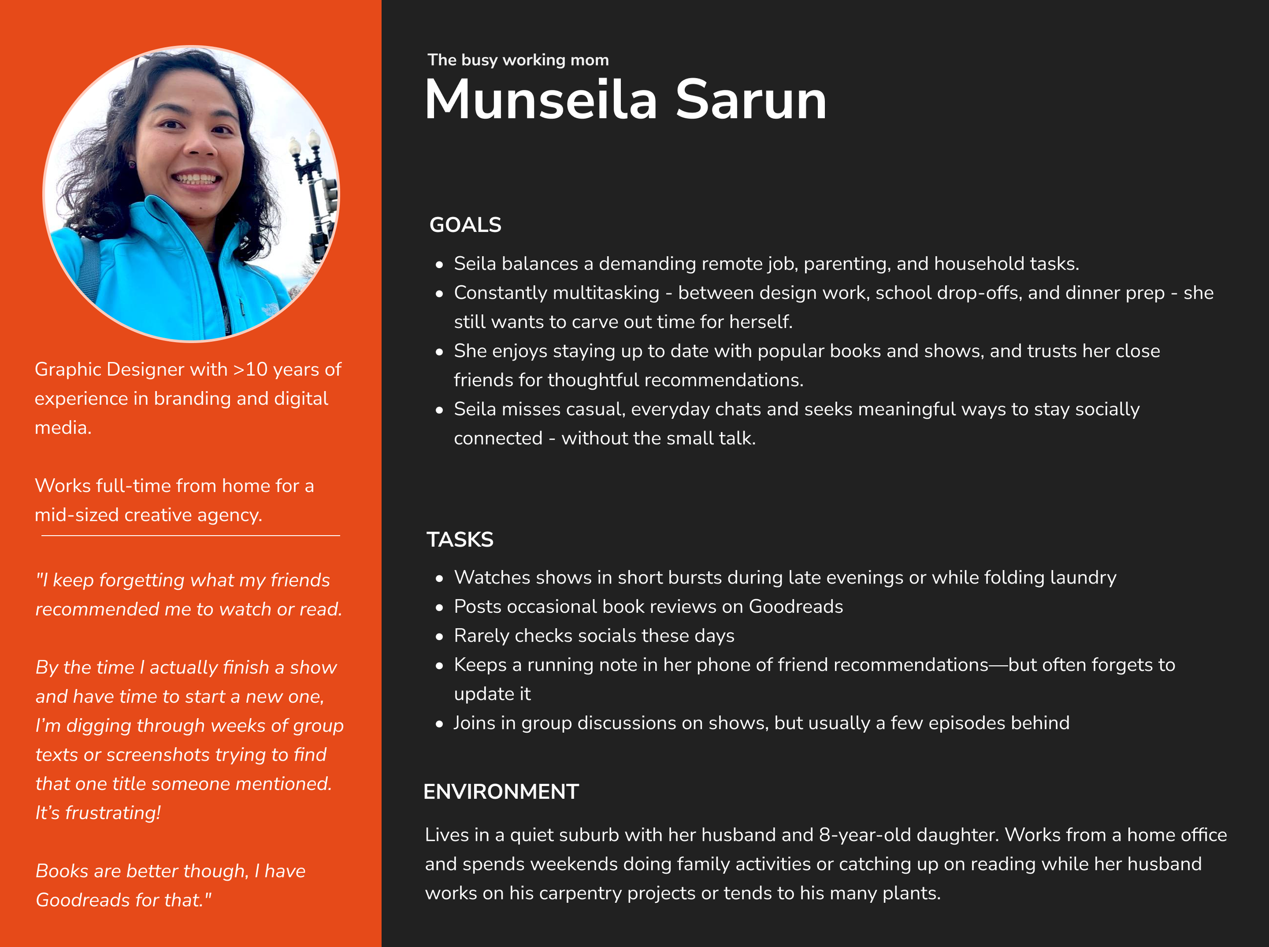
Based on the above focus, a proto-persona is created to represent NeNam’s target users: Munseila.
Persona
02
Define
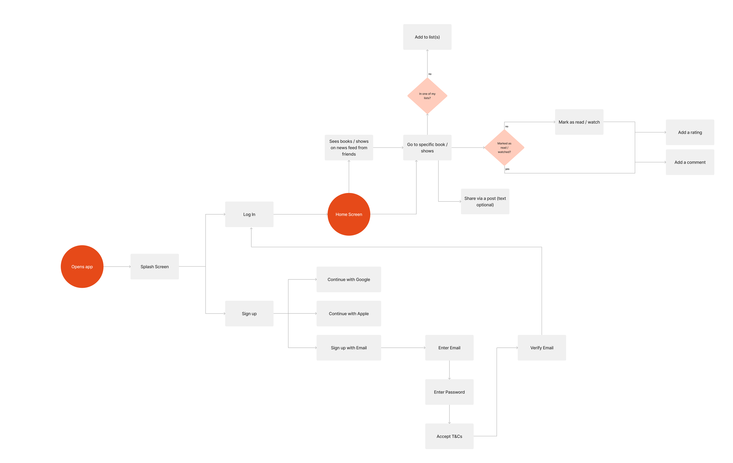
To address the needs of the persona, a set of user stories was created.
Based on these, user flow diagrams were developed to visualize how users navigate the app to achieve their goals.
03
Ideate
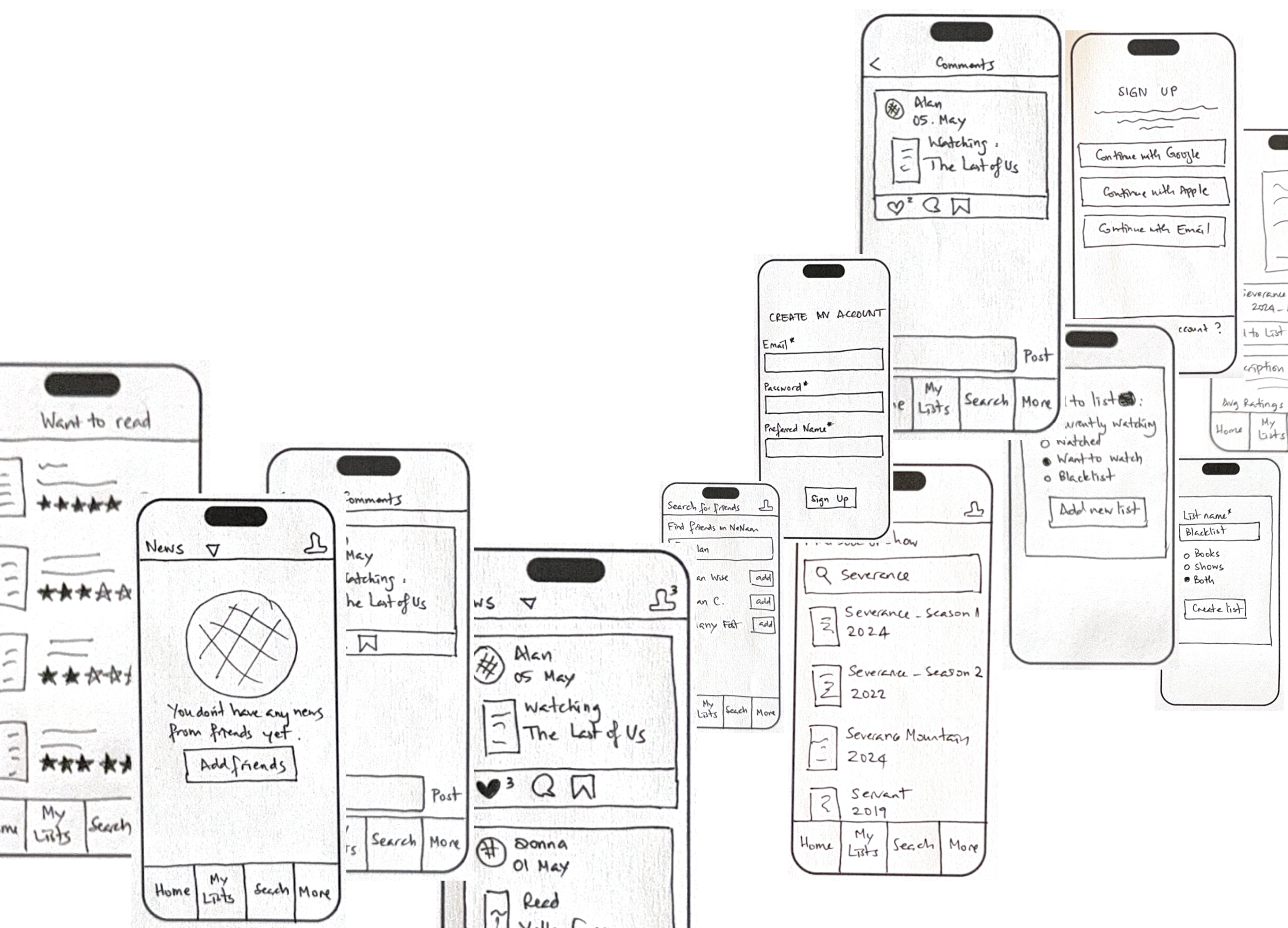
Quick sketches of the screens were created to explore layout ideas and visualize key interactions early on. This helped rapidly test concepts before moving into detailed design.
Quick Sketches
04
Design
In this step, I brought the wireframes to life by defining the visual style - selecting colors, typography, icon sets, and UI elements like buttons, forms, and cards.
I also made imagery decisions, all of which were documented in the style guide.
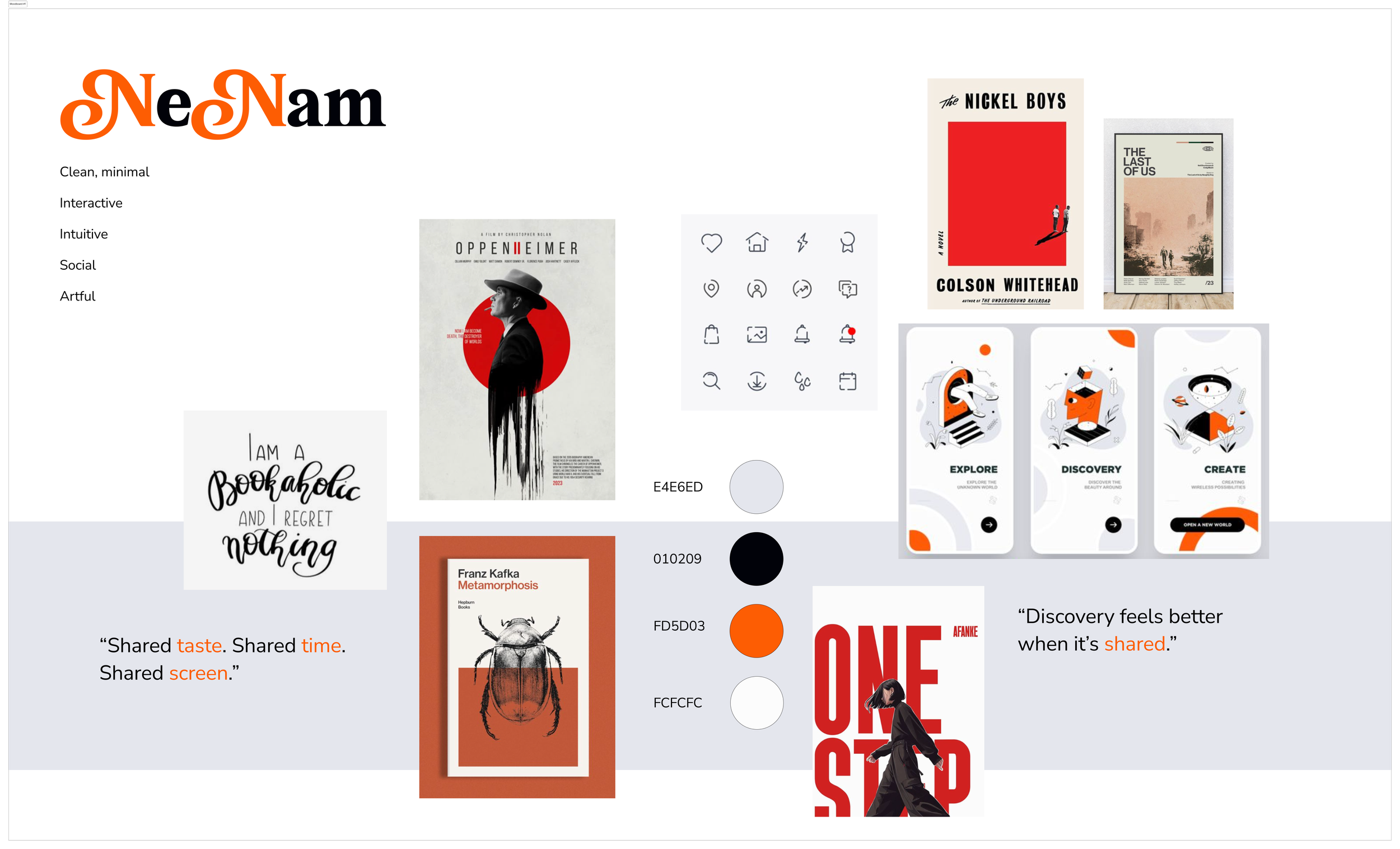
Moodboard
But first, to ensure consistent and compelling user experience that reflects the project objectives, a couple of moodboards were considered and one was selected to proceed further.
Style Guide
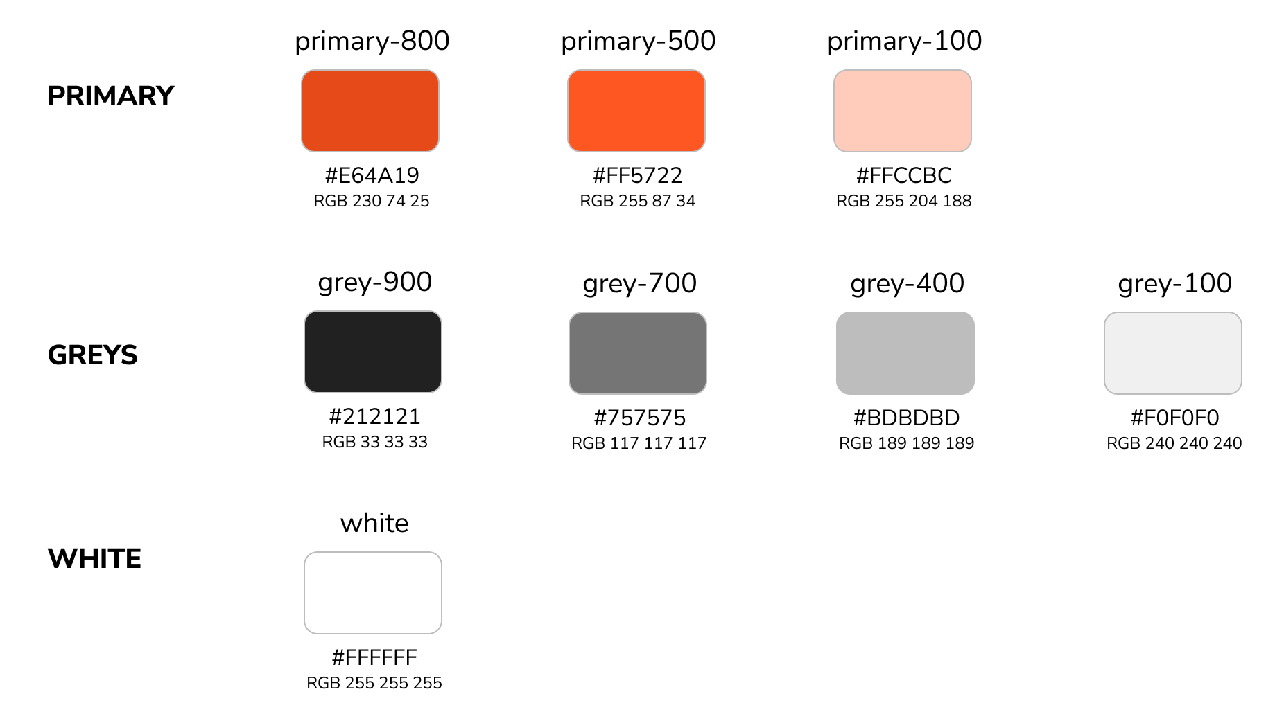
More shades could be generated based off these Primary, Grey, and White variations to suit the need as the brand expands and more functionalities are added to the app.
Colors
Style Guidelines:
Simple & Minimalist
Stroke: 1-2px
Minimum Padding: 3px
Rounded corners: 0.5 to 1px
Icons

Typography
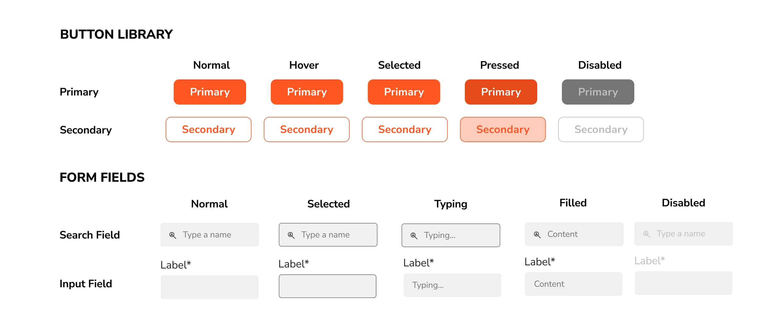
UI Elements
05
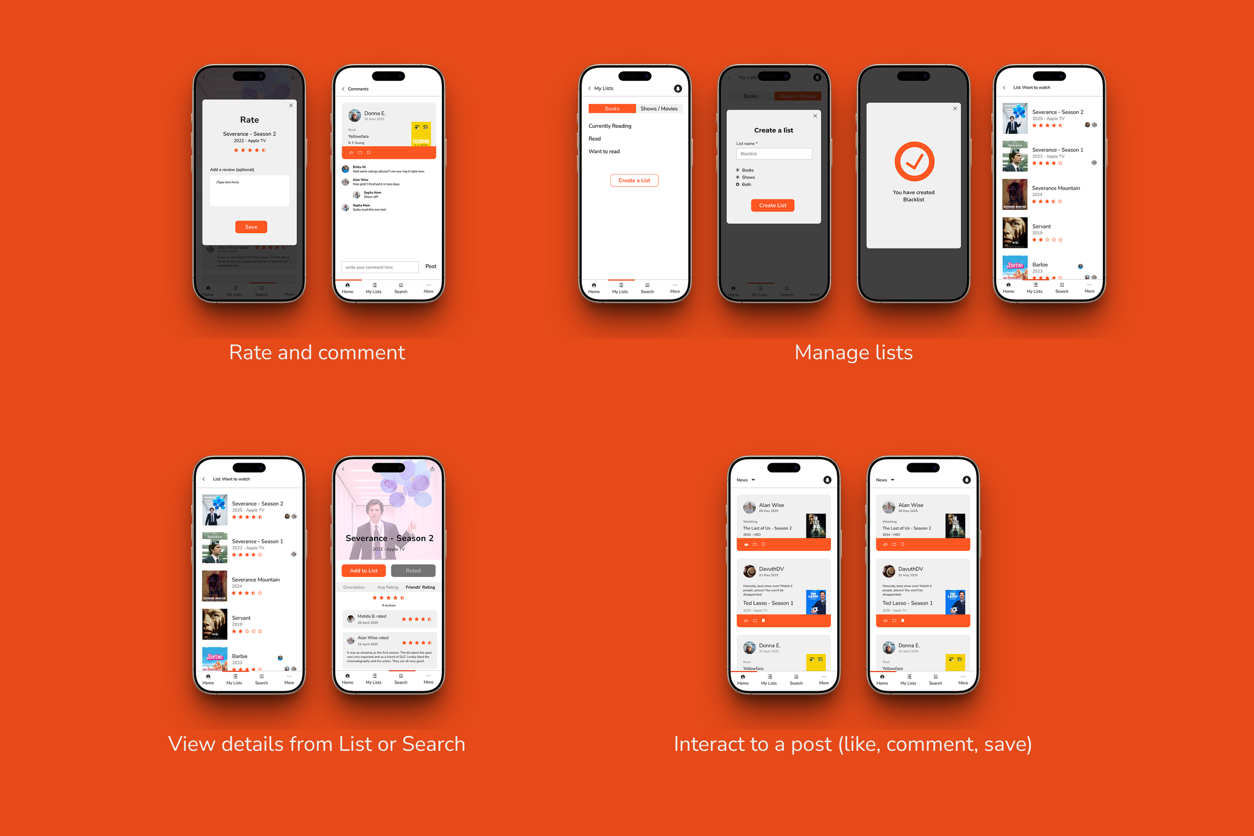
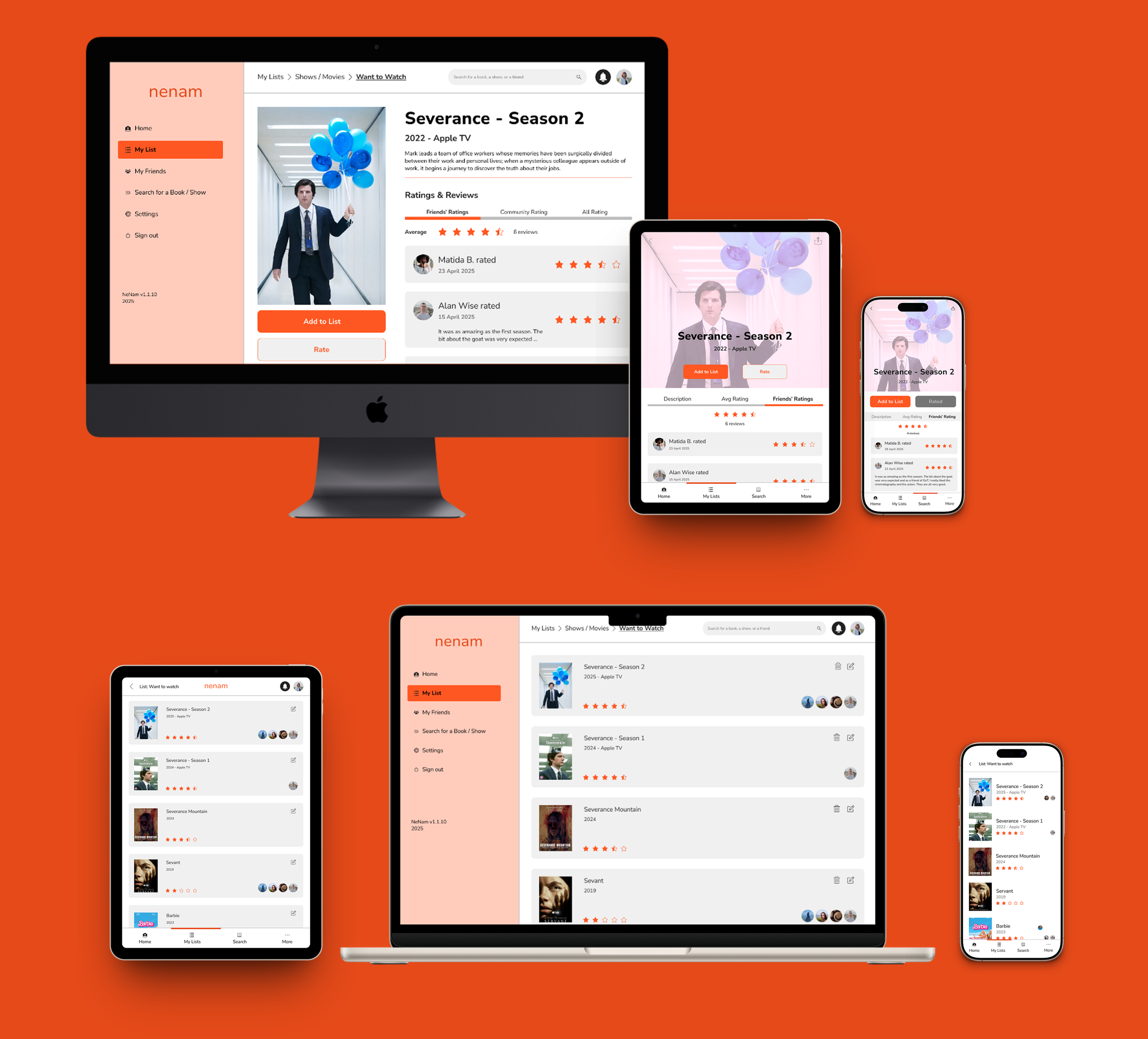
High-Fidelity Prototypes
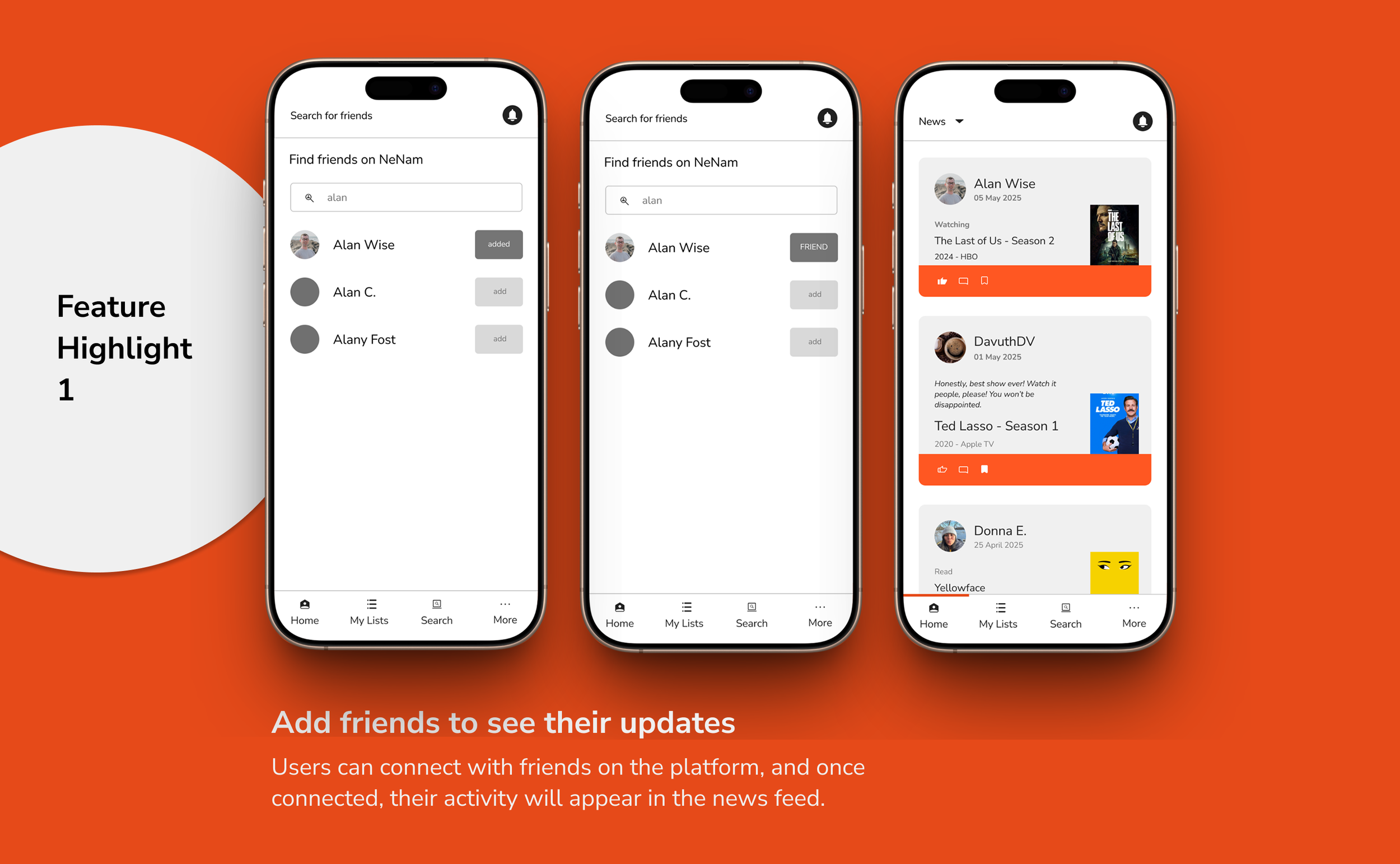
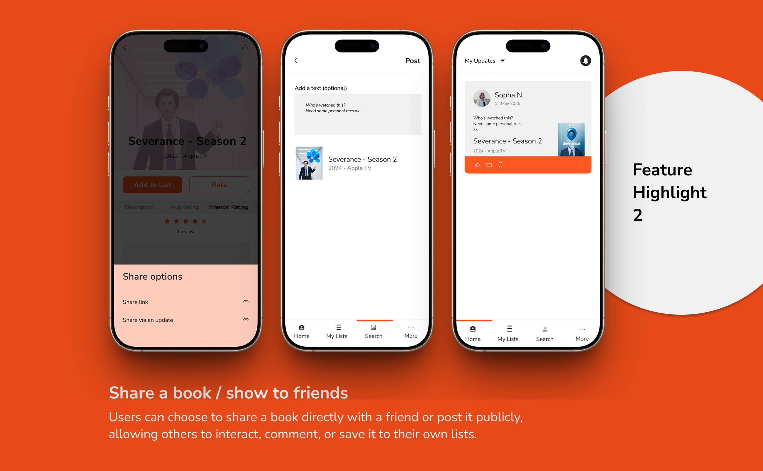
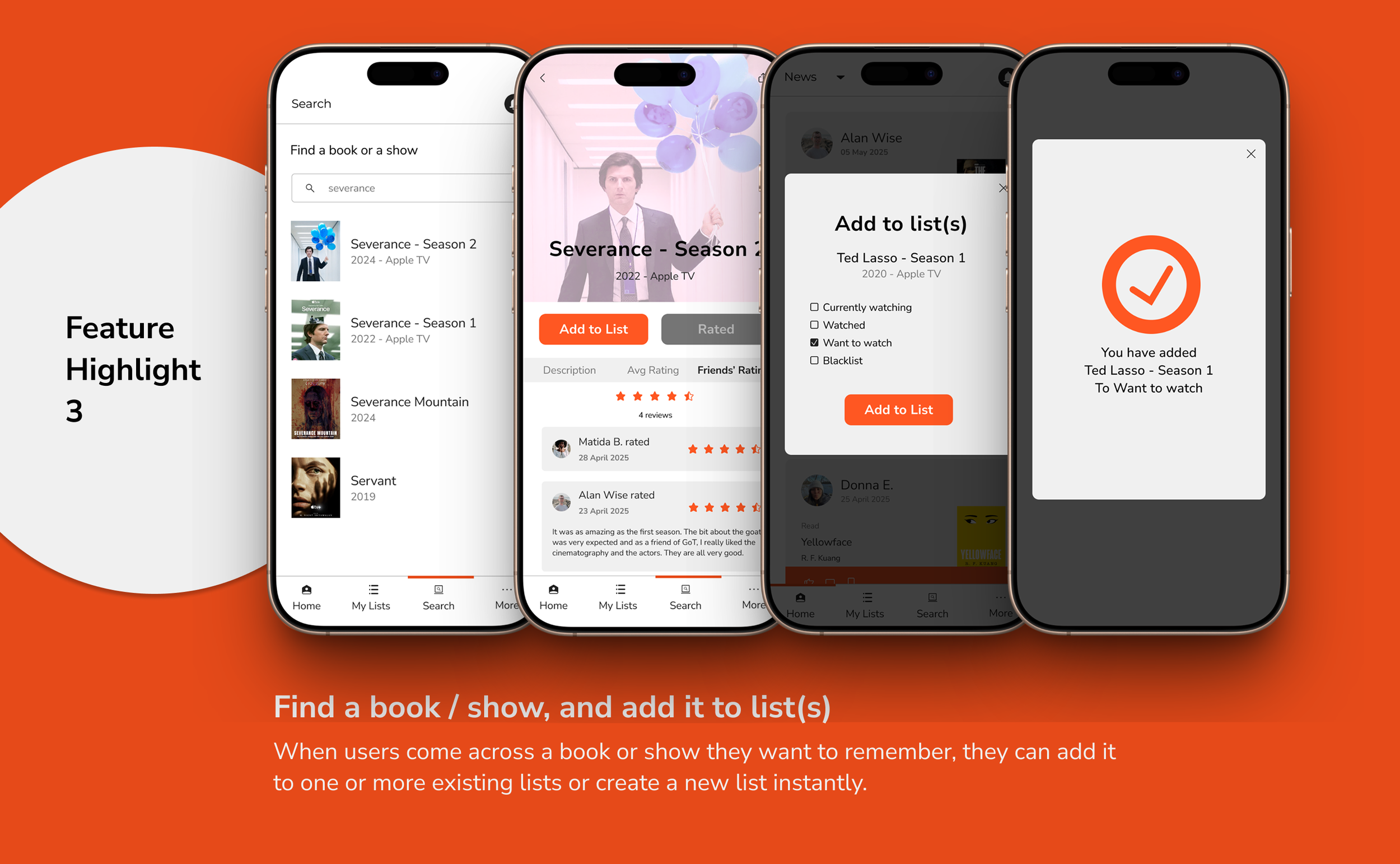
Other Features
Design for
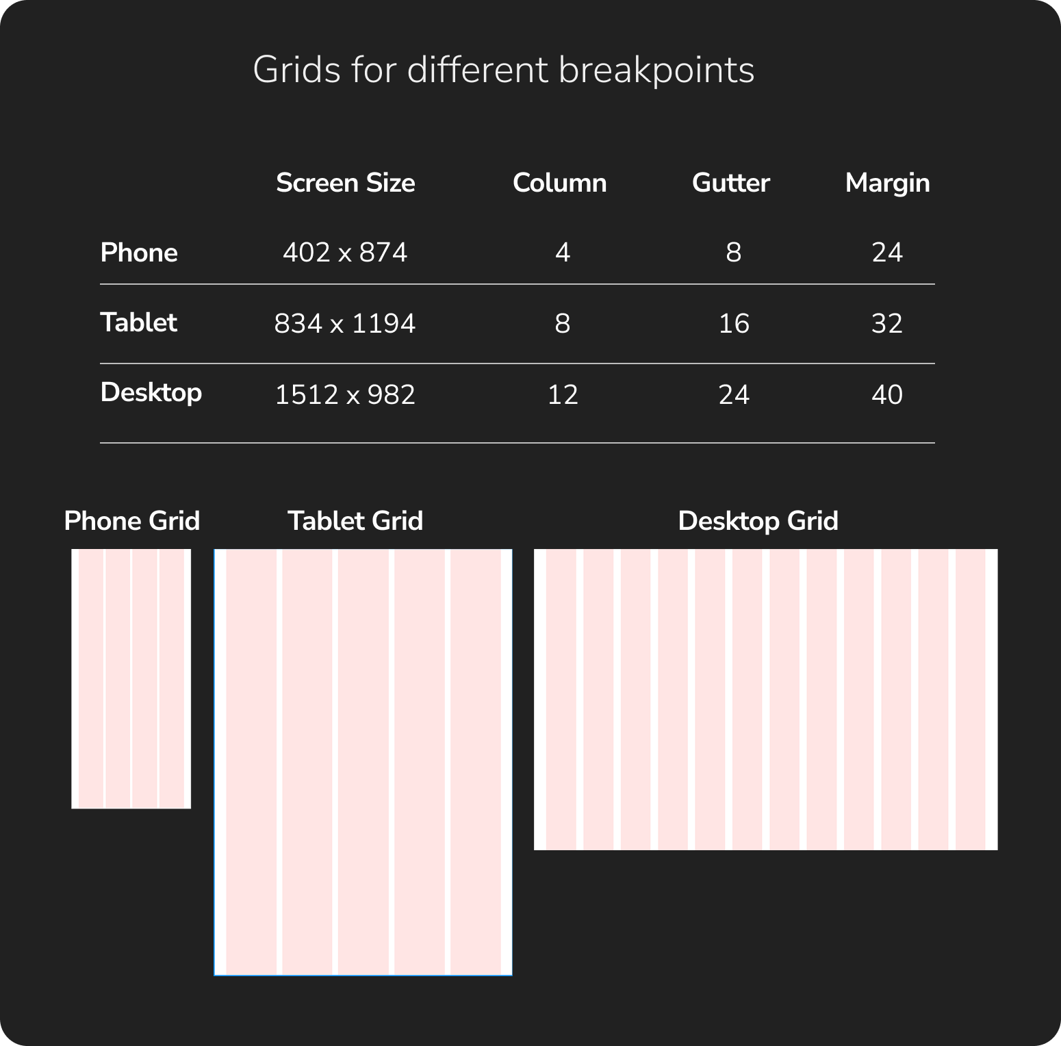
Different Breakpoints
The design process started mobile-first to prioritize core functionality and user experience on smaller screens, then expanded to tablet and desktop breakpoints to ensure a consistent and optimized experience across all devices.
Mobile-first Approach
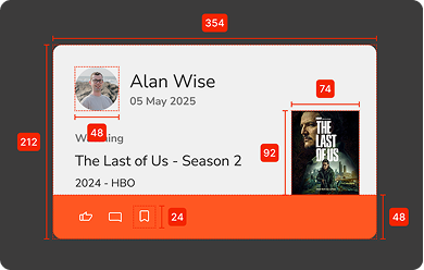
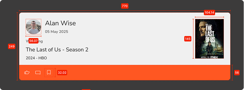
UI elements were adjusted to fit the new screen sizes, including component dimensions, typography, images, and icons that define the overall interface patterns.
-
Mobile
-
Tablet
-
Desktop
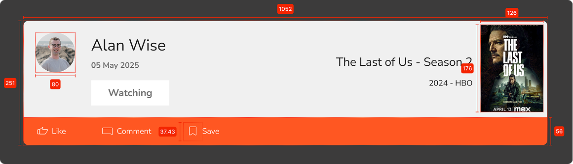
Examples of Different Breakpoints Applied
Interactive Prototype
Interactive Prototype
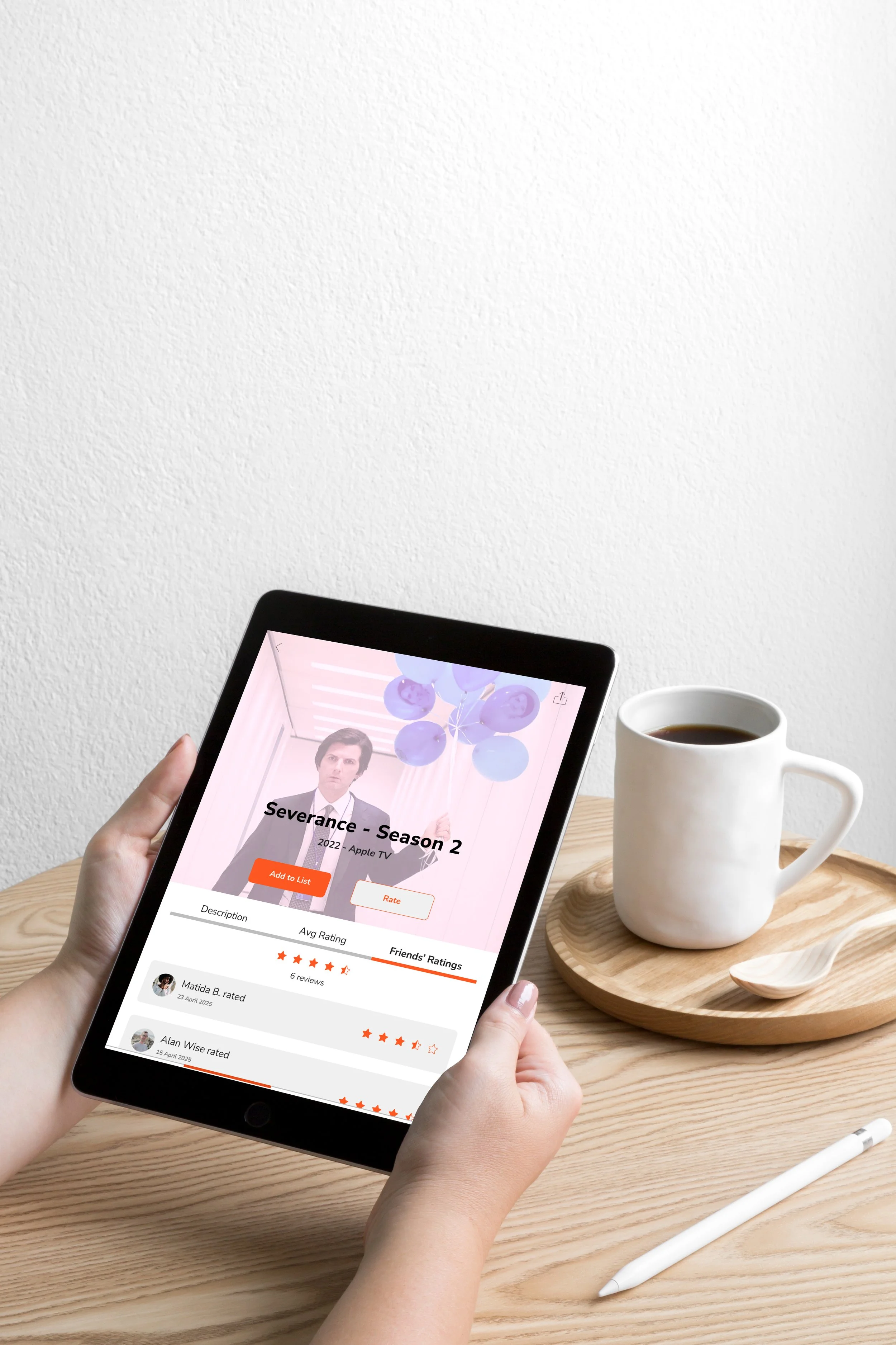
Last but not least, the interactive prototype.
Learnings
Working on NeNam has been a deeply personal and rewarding journey. It started with a simple frustration - losing track of friend recommendations - and grew into solving a real gap in the market: the lack of a socially-driven, shared discovery experience for books and shows.
I had a lot of fun crafting this experience, especially with the stronger emphasis on visual storytelling—from curating moodboards that captured the app’s tone to designing a full set of custom icons from scratch. These creative parts of the process really brought the UI to life.
One of the biggest design challenges was balancing a clean, minimalist aesthetic with the vibrant, often visually noisy content like book and show covers.
With so many images being platform-generated, I had to develop a color palette and UI language that felt simple and cohesive while letting the media shine. At the same time, for a social app it is important to have a look and feel that is engaging and lively. It pushed me to think more intentionally about contrast, space, and how to guide the user's eye without overpowering the visuals.
Overall, NeNam has been an exciting and enriching experience. I’ve learned a lot, had fun building something from the ground up, and I hope to bring this concept to life one day.