Pagora
[Pagar-Agora] - a comprehensive all-in-one digital wallet app.
A complete end-to-end UX Case Study
Objective
Allow anyone to shop, transfer money, and more without a debit or credit card
or the need to visit a physical bank or store.
Project Details
Team
Solo project as UX designer, backed by a decade long experience as a Product Manager.
Duration
Aug 2024 - Mar 2025
Tools
Figma, Optimal, Lyssna, Otter.AI
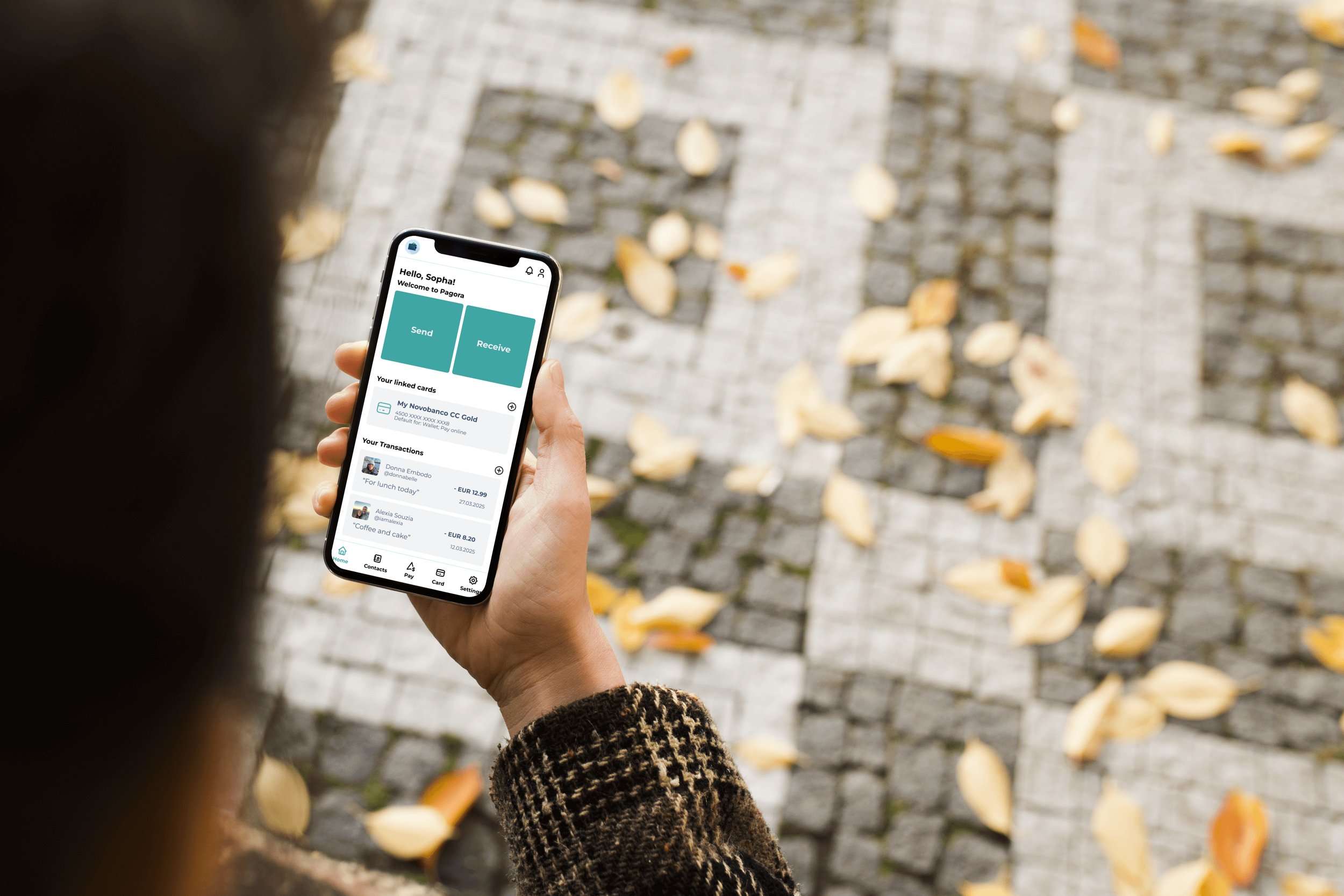
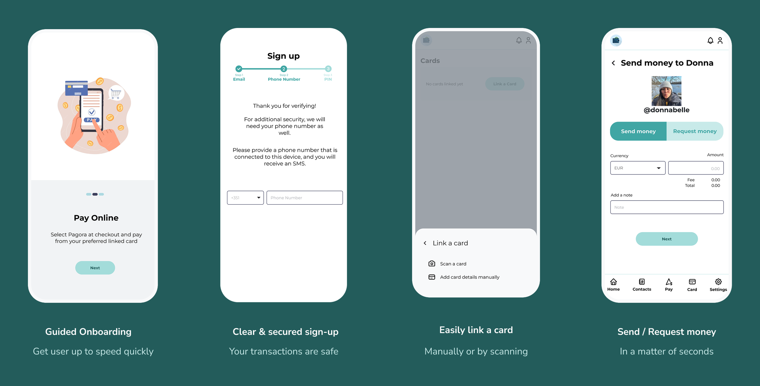
Feature Highlights
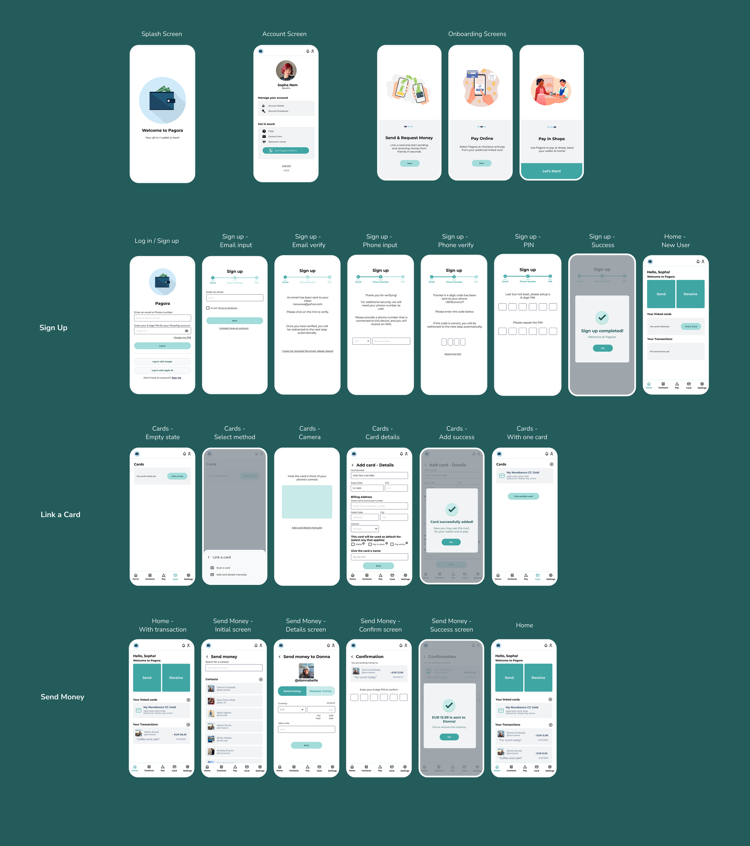
Here is a sneak preview of some final mockups to demonstrate the core features of this web app.

Part 1
Understanding the Problem
Users have the following pain points
Most digital wallets only work online (on web), but cannot be used to pay at physical locations
1
Not always have a debit / credit card at hand
2
Risk of unauthorized access and fraud
3
Problem Statement
Users need a digital wallet that allows them to pay online and offline, transfer and receive money without the need to have a debit / credit card at hand or the need to go to the bank.
because it is much more convenient to have a one-stop app to perform all of these actions and not having to carry a physical card.
We will know this to be true when user could transfer, receive, and pay online and offline without having a debit / credit card present and feel that it is secure.
Competitor Research
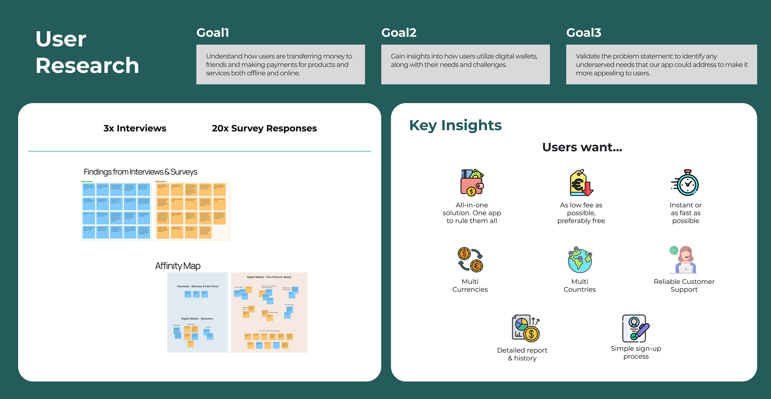
User Research
Part 2
Defining the Users
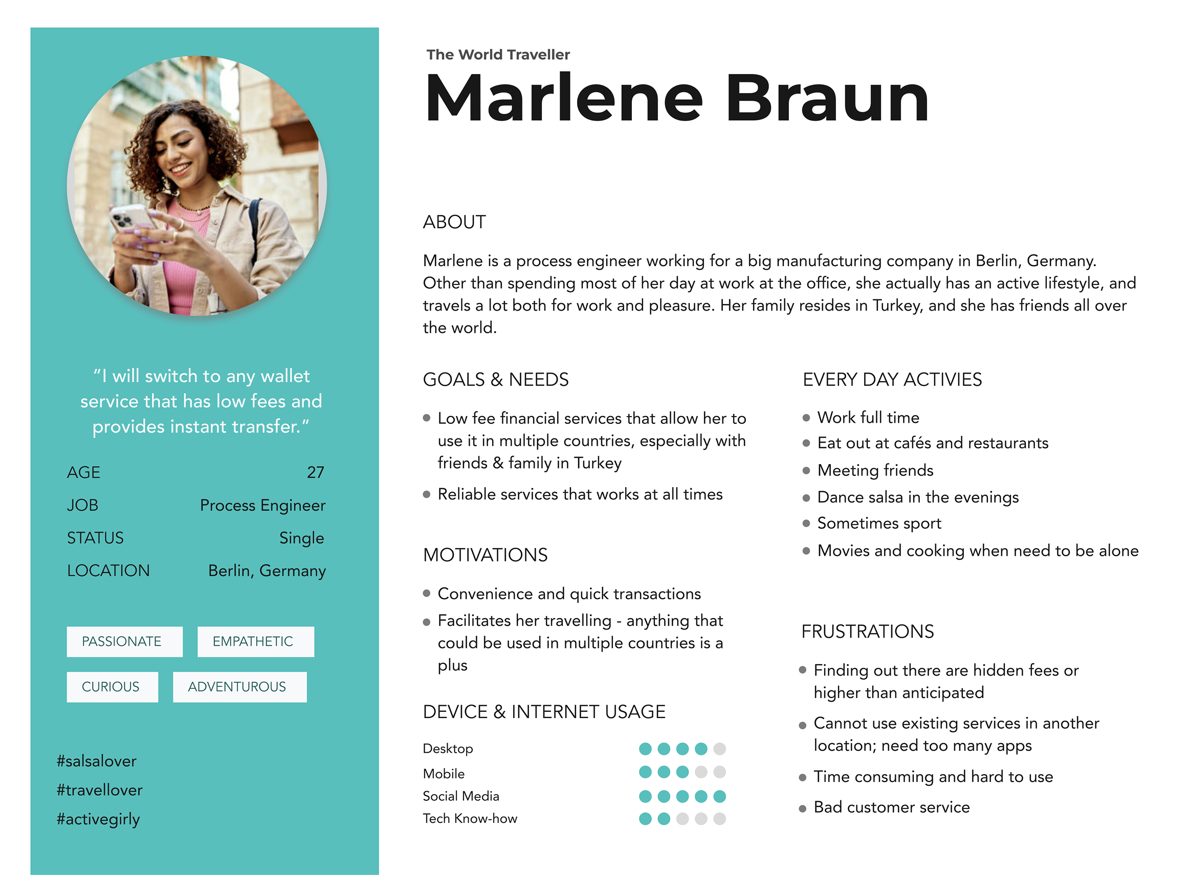
Meet our main Persona:
Marlene
I brought the data to life by creating user personas—fictional characters that embody the motivations, needs, and frustrations of our target audience.
Among them, I selected Marlene as the primary persona, as she best represents the key pain points we aimed to address with Pagora..
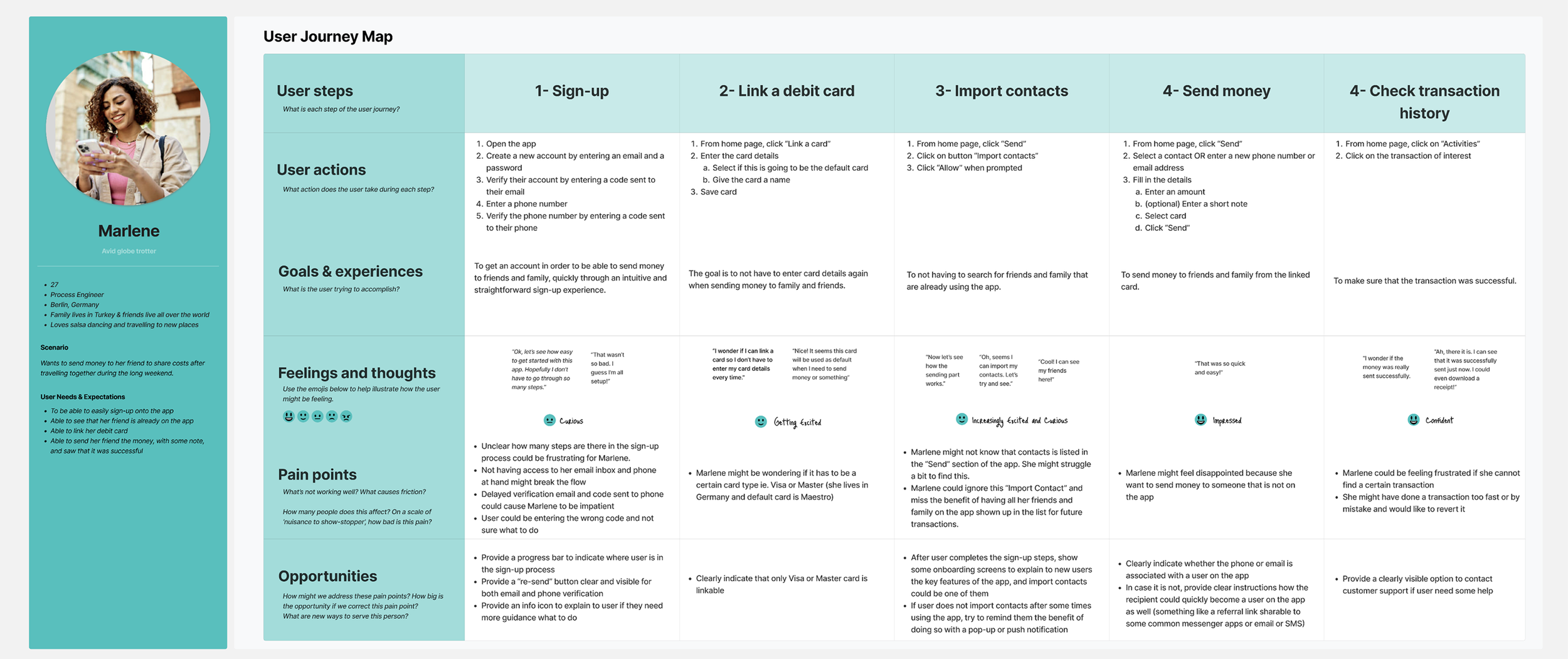
User Journey
Each persona has unique needs, so I mapped user journeys to capture their tasks, thoughts, and emotions.
This example focuses on Marlene, our main persona, highlighting pain points and opportunities to improve the app experience.
Part 3
Defining the Solution
Refining
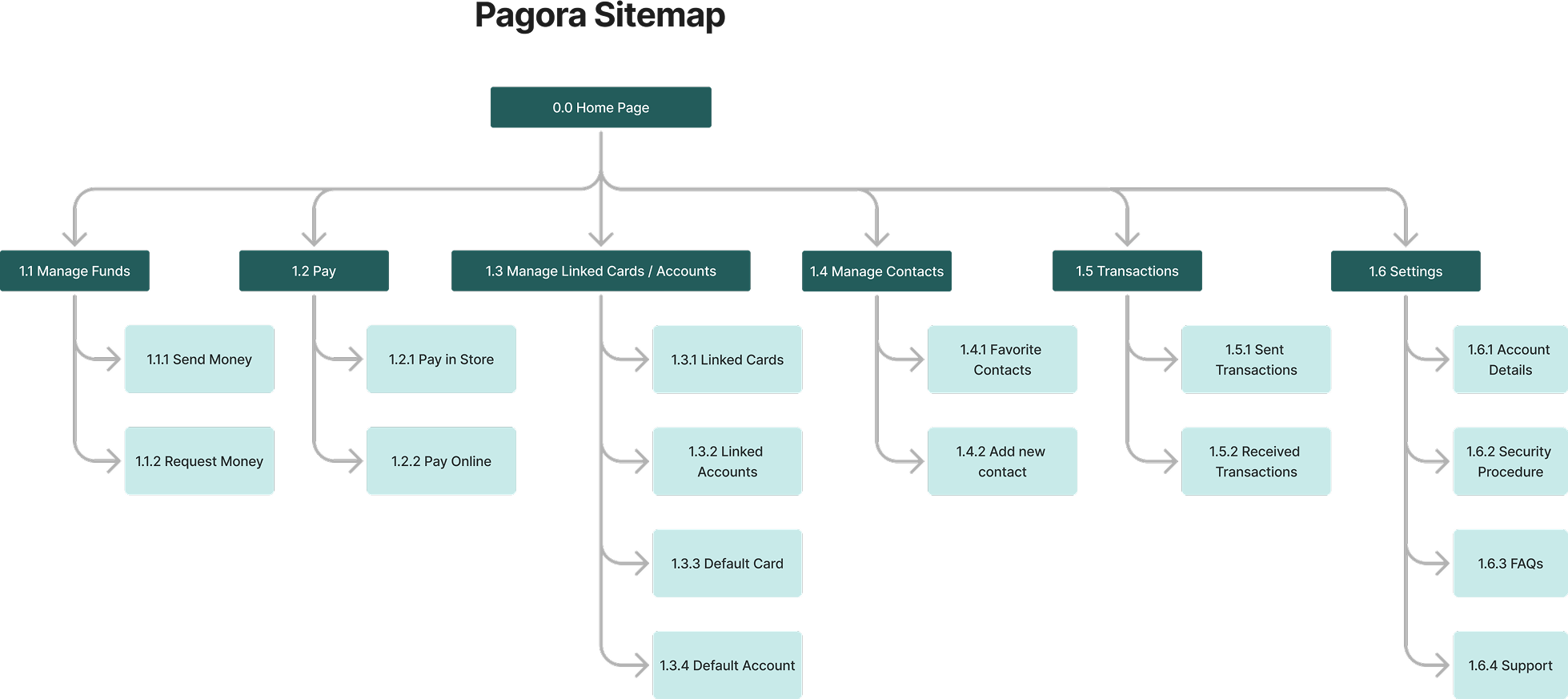
Information Archiecture
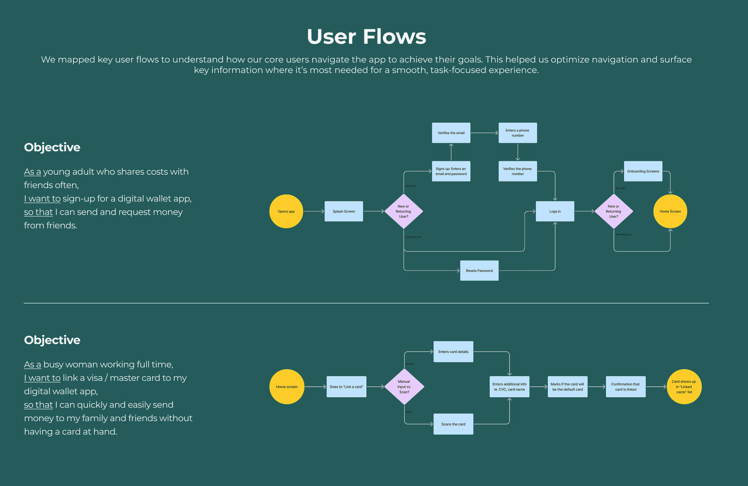
Step 1
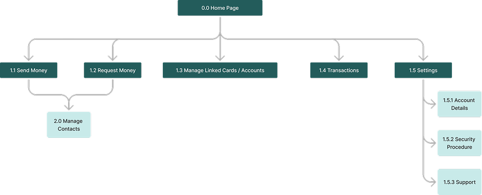
After identifying the user flows, an initial sitemap has been designed.
Step 2
Then a card sorting exercise is kicked off with the tool “Optimal Workshop” with 7 participants.
This allowed me to not base the information architecture on my own logical intuition, but more to majority of potential users of the app instead.
Examples of interesting learnings:
Have “Send Money” and “Request Money” in the same page rather than separating them
Contacts should be its own page, but could also benefit from having easy access from other pages for ease of use
More filters in transactions could be useful for users
Step 3
Based on the Similarity Matrix & Dendogram Analysis, a new sitemap is born.
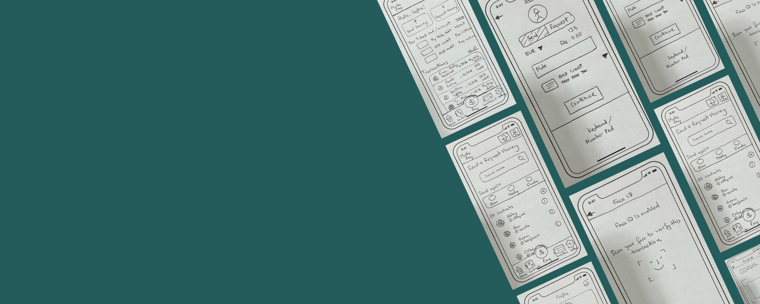
Quick Sketches
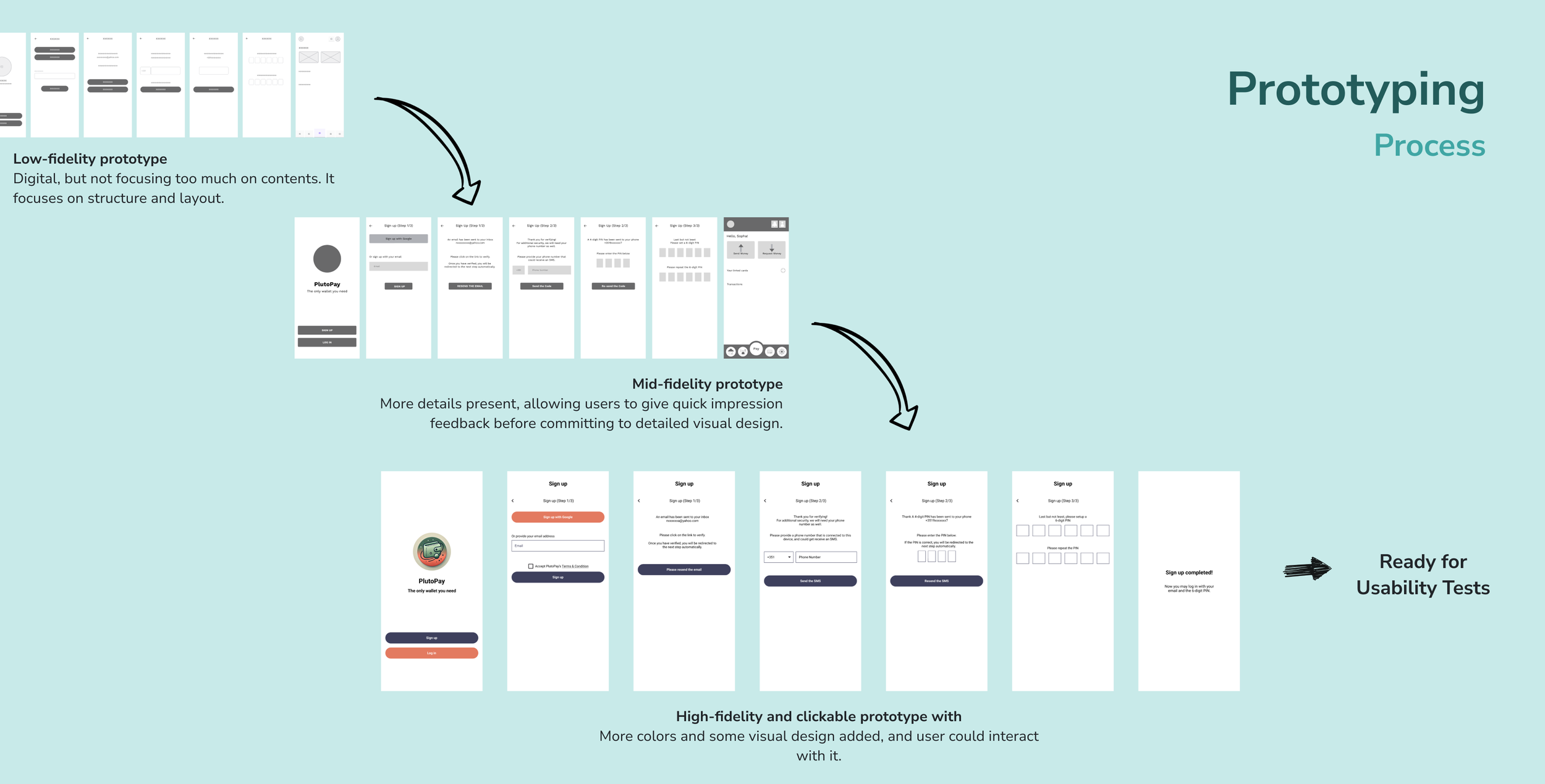
Next, I laid out the information architecture identified on simple sketches. I explored different layouts and considered different ways to present information ike images, texts, a combination of both, and icons.
These sketches allowed me to rapidly explore and communicate early design ideas without getting caught up in visual details. Working at this level of fidelity helped facilitate quick feedback, making it easy to iterate and validate concepts early in the process. It also ensured that the problem were really addressed before investing further.
Ultimately, the goal was to keep the process agile and user-focused—using low-fidelity wireframes as a thinking and collaboration tool to guide the product in the right direction from the start.
Make it stand out.
Part 4
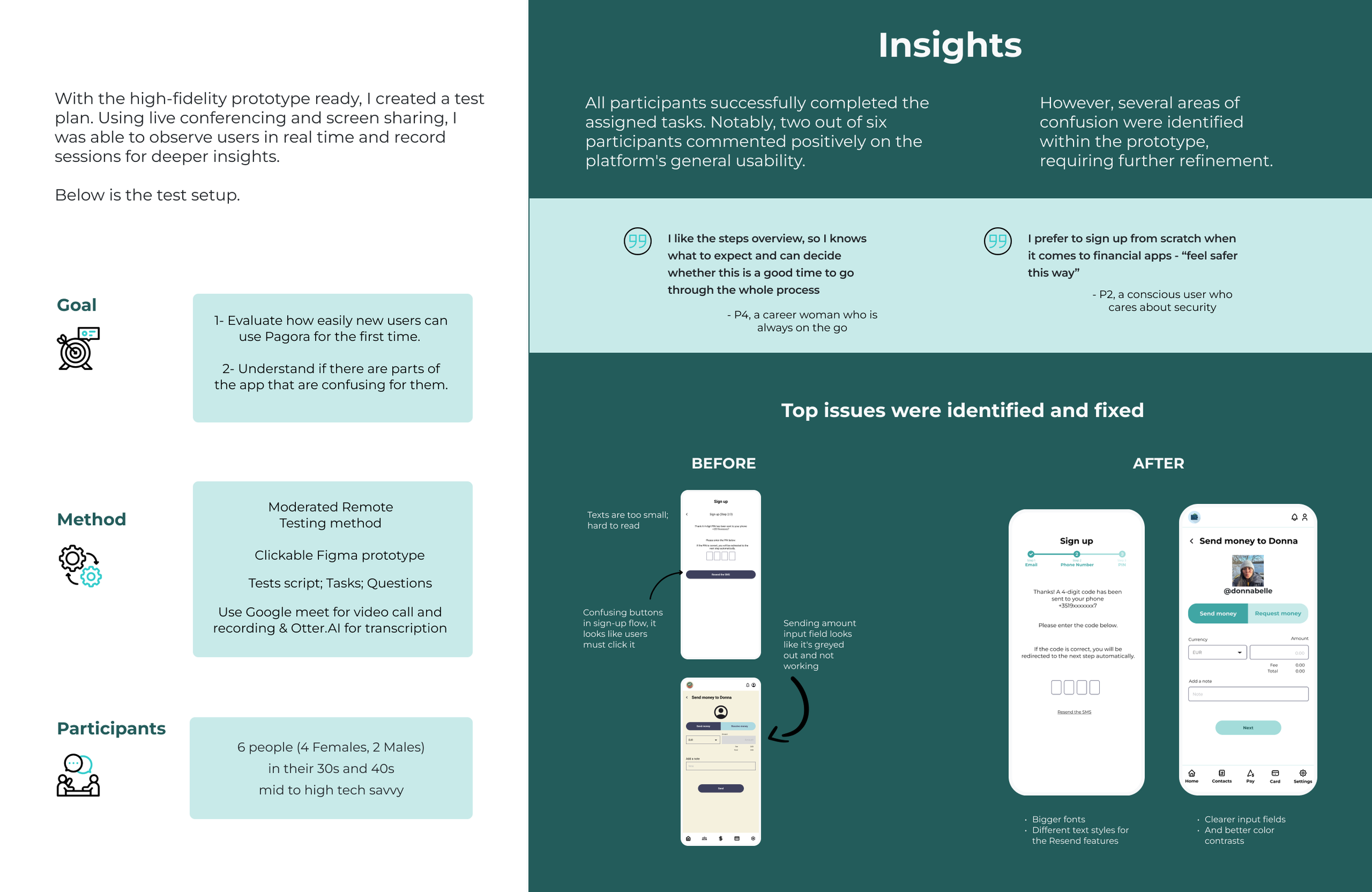
Usability & Preference Tests
Usability Tests
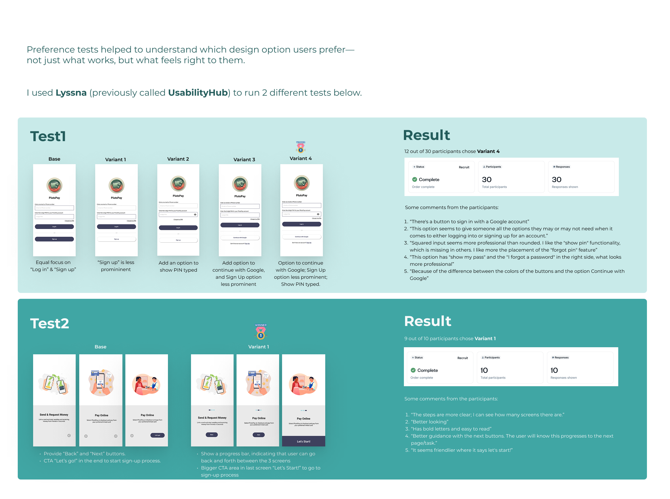
Preference Tests
Part 4
Final Deliverables & Design Handoff
Screens Gallery
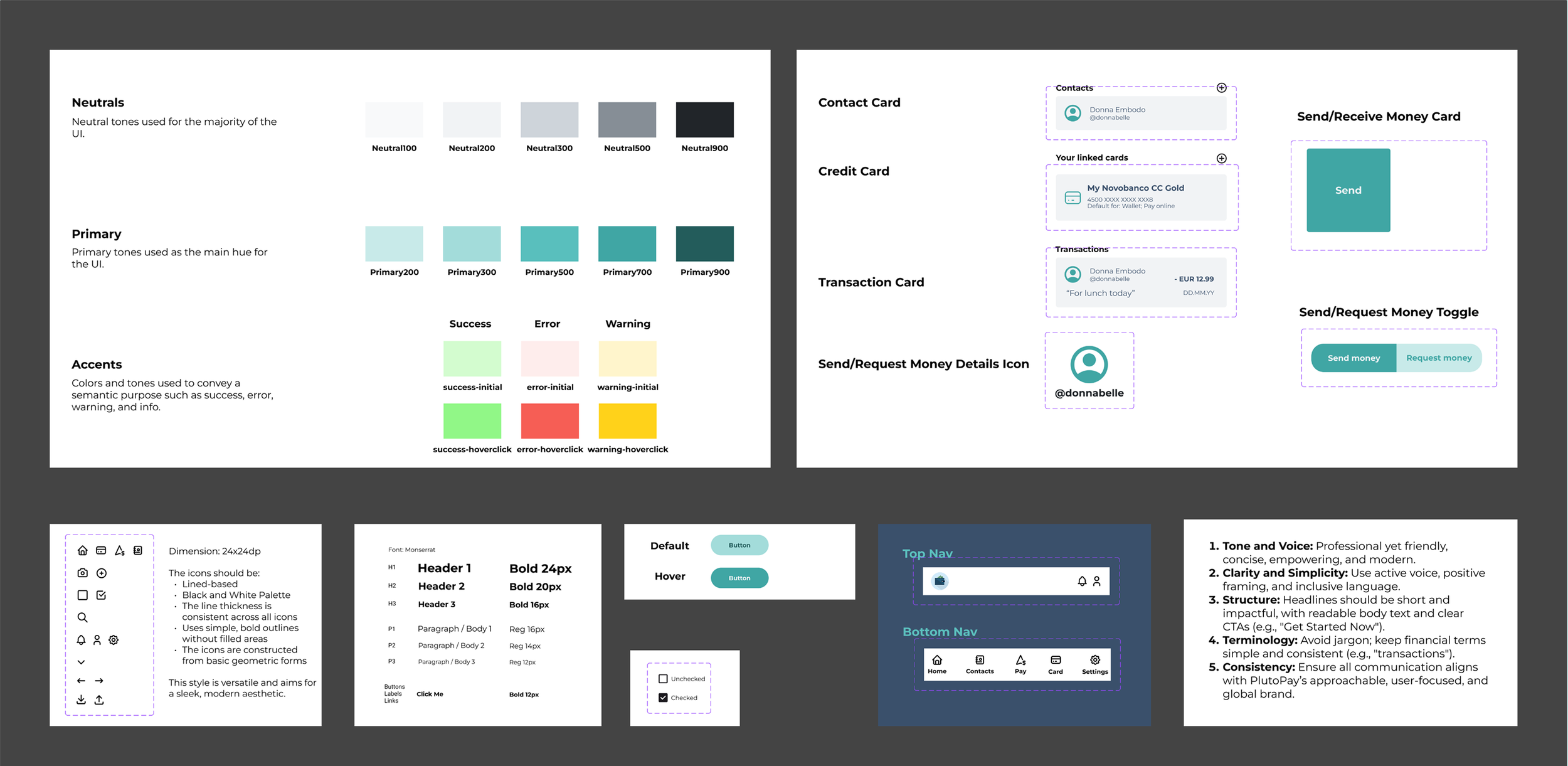
Style Guide
& Design System
Interactive Prototype
Interactive Prototype
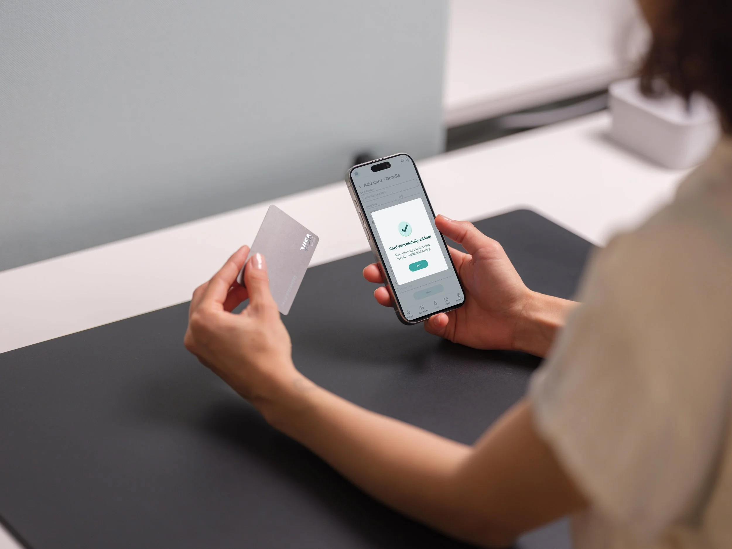
Last but not least, the interactive prototype.
Part 6
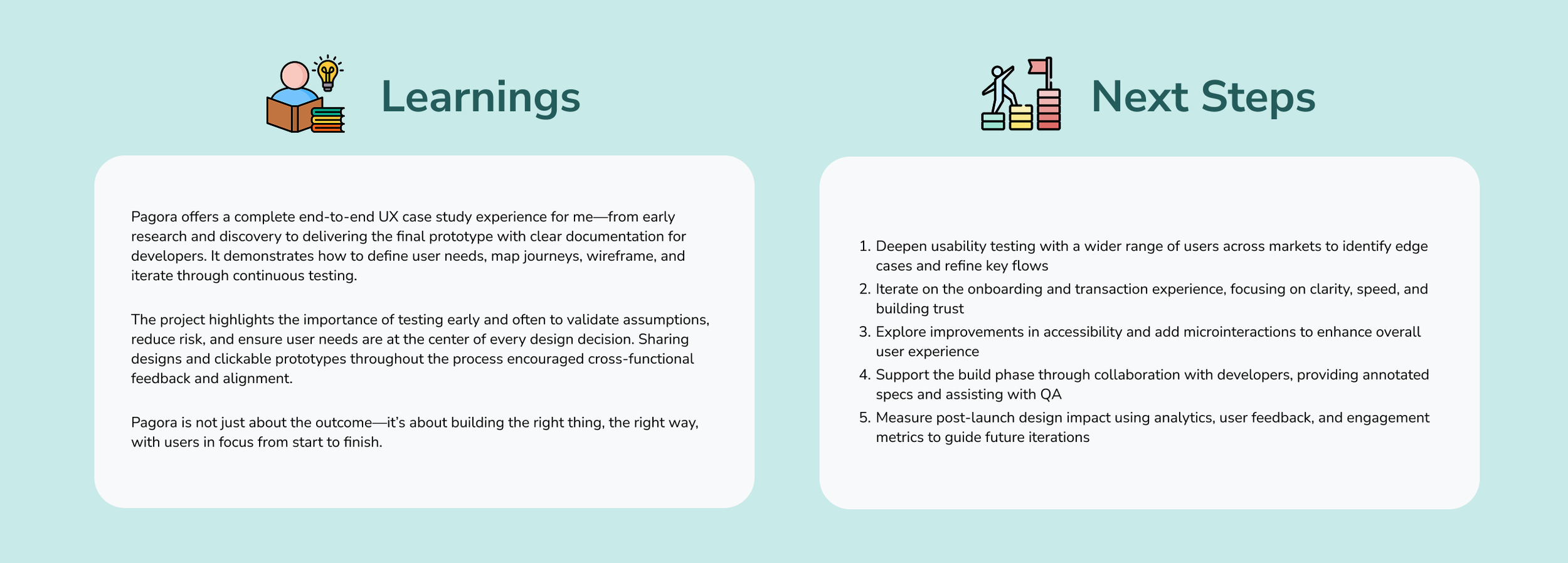
Takeaways (Learnings & Next Steps)